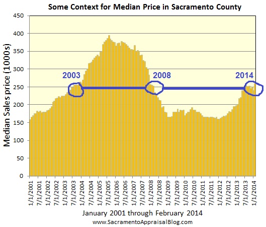
The below graph is from Ryan Lundquist's excellent blog. I find this very visually interesting. I don't think it necessarily tells us a whole lot but just visually shows us where we are in comparison to the last 14 years. Based on this, where do you think we are headed??? Way up?? Flat?? Down?? If i had to guess, I think the next few years will look like 2000 to 2003. Slow, steady growth with some minor peaks and valleys.

Some Context: If you’re looking for context for price levels, current values are similar to what they were during the first quarter in 2008 and toward the last quarter of 2003. Of course this is for the entire county and specific neighborhoods can vary greatly. Classic neighborhoods tend to be ahead of county numbers and the condo market tends to lag behind county numbers.


No comments:
Post a Comment